Barb's Top Window Treatments Designs for 2013 – Part 1
Over the last 10 years I have designed thousands of window treatments for my customers in the Tampa area and beyond. And like everything else, styles and designs evolve and colors change.
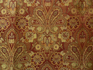
When we opened in 2004 the treatments were more formal – we used yards of dupioni silk for swags and drapery panels with lots of tassel trim. The popular colors being used for home décor were red, gold and green. And the fabric designs were very traditional – paisleys, stripes, floral, and plaids.
Some of our more popular fabrics were – Greylock- this fabric matched everything!!!
 Neptune was another favorite, along with Venus and Mars. We sold yards and yards of these fabrics!!
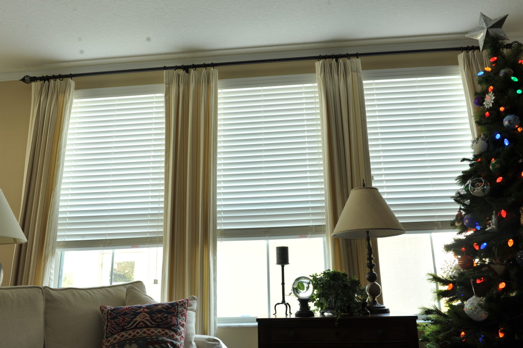
Today’s treatments are trending toward a much simpler designs. Voluminous draperies and swags have been replaced with simple stationary drapery panels on a beautiful wood or wrought iron rod. And instead of the draperies embellished with tassel trim, we are using more flat trims like these. I am amazed at the vast selection of widths, patterns and colors.
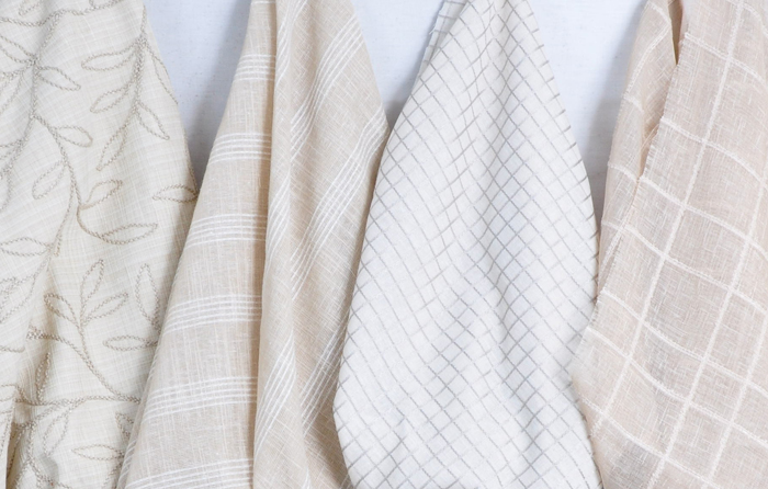
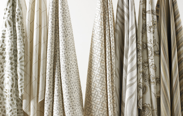
The most popular colors in fabrics this year have been the greys and neutrals. My customers are keeping the envelope neutral and bringing pops of color in with the accessories. The paisleys, stripes, and plaids have been replaced with solids and geometrics. Floral designs are still popular, but they are larger in scale, and are brightly colored.
Recently, I changed out my dining room treatment. I took down my favorite red, gold and green plaid Queen Ann top treatment and draperies, replaced it with a linen blend fabric with just a hint of metallic – the fabric shimmers. We also attached Greek key flat banding trim down the leading edges and across the hemline. It’s elegant yet it fits in with our relaxed lifestyle. It was actually a very simple change and everything else in the room remained exactly the same (Bob was thrilled). I’ll have pictures soon, I’m waiting for my bedroom treatments to be installed, then I will have Jorge (my photographer) over for a photo shoot.
Here are some of my favorite drapery panel pictures. I love the neutral palette in this room!
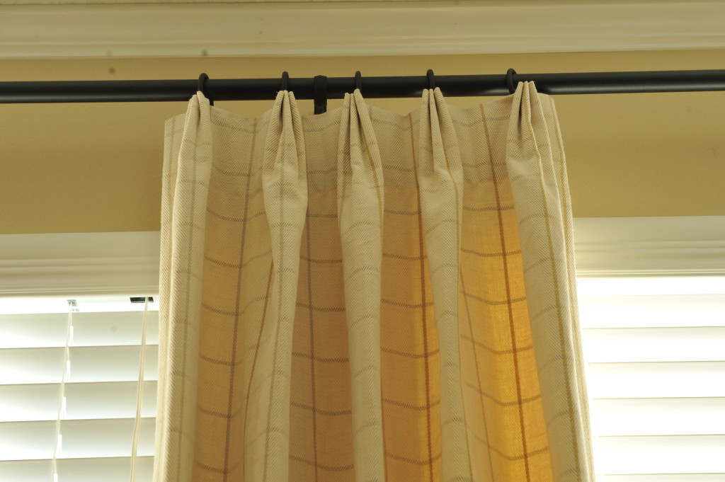
Classic window pane plaid –
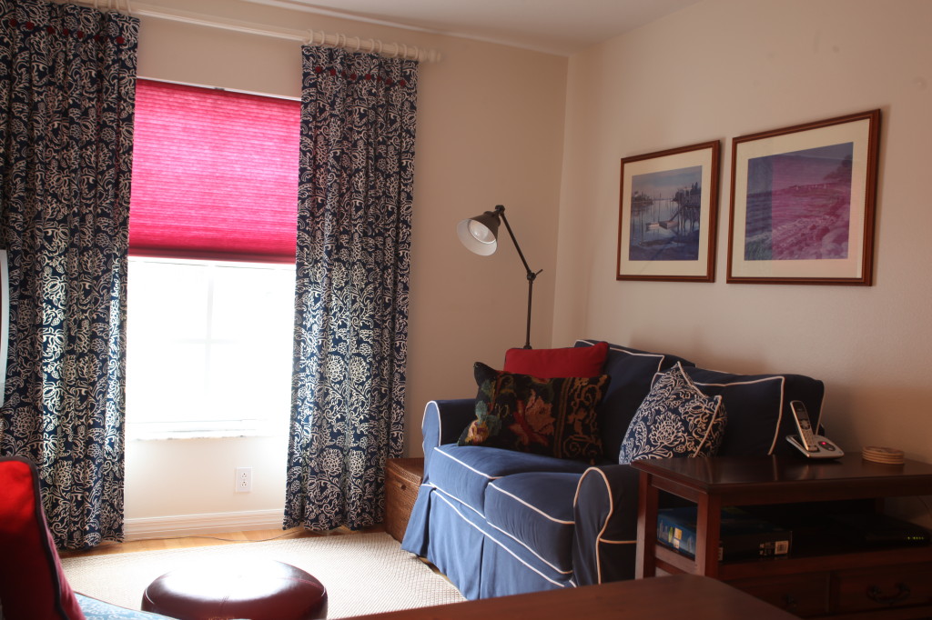
Red, white, and blue – my favorite color combination!
Love the banding!
Timeless blue and white!
What’s on your windows? We would love to hear from you :)!
Next week Part 2 of Barb’s Top Window Treatment Designs – Roman Shades!! OMG we have been designing so many this past year!







7 Responses to Barb's Top Window Treatments Designs for 2013 – Part 1